49 works in this view — arrow keys or swipe to move between them.
Dance in Art
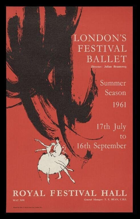
London Festival Ballet Summer Season 1961
Unknown
- Collection:
- Poster
- Source:
- Victoria and Albert Museum
- Rights:
- Rights vary by item — check the source record before reusing this image. Source record ↗
- Recorded as:
- V&A — check rights per item
The poster captures a moment when London Festival Ballet was establishing itself as a major company, and when ballet's public image was shifting toward modernist visual presentation. For dance historians, it shows how the medium of ballet was promoted to audiences and what visual language was used to convey the balance between technical precision and artistic expressiveness that defined post-war British ballet.
What you are looking at
This is a theatre poster for the London Festival Ballet's summer season, printed in the characteristic chromatic style of 1960s promotional design. The composition is dominated by a large expressionistic ink drawing in dark charcoal or black, occupying the left two-thirds of the poster, depicting what appears to be a dancer's limbs and torso in a flowing, abstract arrangement—arms and legs rendered as bold, sweeping gestural marks suggesting movement and extension. Against this dark abstraction, a small figure of a ballerina in white appears in the lower right quadrant, depicted in classical pose with one leg extended and arms raised. The ballerina wears a white tutu and pointe shoes, rendered in silhouette or high-key contrast against the coral-red ground. The overall composition uses the stark visual contrast between the dynamic dark drawing and the pale, precisely positioned figure to suggest both the physicality and the ethereal quality of classical ballet.
The dancing
The dominant dark marks suggest a single dancer's body in an extended, possibly inverted or highly rotated position—the limbs and torso are splayed and twisted in a way that implies significant control and flexibility rather than a static pose. The small white figure in the lower right is positioned in a classical alignment: one leg bent in supporting position, the other extended, arms raised in a lifted frame typical of classical ballet. The contrast between the two representations suggests a moment of dynamic elevation or suspension, with the larger abstract form capturing the energy of the movement and the smaller white figure representing the dancer's actual position at a moment of control.
The dance depicted
This poster advertises classical ballet, specifically the London Festival Ballet company's summer season. The small figure in white pointe shoes and tutu leaves no doubt about the genre. The larger expressive drawing may represent the impression of movement or a second dancer, or it may be a purely artistic choice to suggest the dynamism of the medium. The work dates to 1961, when London Festival Ballet (now English National Ballet) was an emerging company directed by Julian Braunsweg. The style of representation—mixing precise figuration with expressionistic gesture—was common in mid-century ballet publicity and suggests an aesthetic that valued both technical precision and artistic intensity.
How it was made
This is a lithographic poster, recognizable by the flat, bold color separations and the characteristic way the dark charcoal drawing sits against the uniformly printed coral-red ground. The technique allowed for large-scale reproduction and dramatic visual impact suitable for street and theatre display. The combination of bold gestural drawing and precise typography was cost-effective and visually striking, making lithography the standard medium for dance promotion in this period. The image shows confident draftsmanship in both the expressive marks and the delicate rendering of the ballerina figure.
About this work
This is a lithographic theatre poster announcing the London Festival Ballet's summer season at the Royal Festival Hall from July to September 1961. The poster combines expressionistic drawing with classical ballet imagery to communicate both the dynamism and the refinement of the company's work. It is a representative example of mid-century British arts publicity, when dance companies began to present themselves through visual sophistication rather than narrative illustration alone. The work demonstrates how graphic design conveyed the aesthetic values of contemporary ballet to the London public.
How to look at it
The poster works through visual contrast rather than narrative detail. The viewer's eye is drawn first to the large dark form, which reads as dynamic and somewhat unsettling—a disruption of the orderly red field. Only then does the small white figure resolve into legible classical ballet form. This compositional choice mirrors the experience of watching dance: the impression of force and movement, followed by recognition of the technical control underneath. The expressionistic drawing style suggests that ballet is not merely decorative posturing but a serious artistic practice involving intensity and risk. Note how the ballerina's pose—one leg supporting, the other extended, arms lifted—is a fundamental classical position, yet the tiny scale and placement against the raw gestural marks prevents it from reading as merely pretty.
The artist
The artist is not identified in the catalogue record. The work is credited to a design or advertising practice commissioned by the theatre or company, typical of the era when poster design was often anonymous collaborative work. The hand shows confident knowledge of both balletic form and expressionistic drawing; this was likely a designer with experience in arts promotion and a genuine understanding of the medium being advertised.
The period
In 1961, London Festival Ballet was in its formative years, having been founded in 1950. The company occupied a distinctive position between classical tradition (represented by the Royal Ballet) and more experimental approaches to dance. The visual language of this poster—mixing classical figuration with modernist abstraction—reflects the cultural moment in British graphic design, when the austerity aesthetic of the 1950s was giving way to more expressive, confident visual communication. Ballet itself was expanding its audience and its artistic ambitions; the London Festival Ballet would become known for bringing ballet to provincial audiences and for commissioning new work. The poster's modernist design signals that ballet was contemporary art, not merely heritage spectacle.
Where it lives
This is a theatrical poster held in a collection of dance and visual culture materials. It was used for public promotion of a season at a major London venue and represents the documentary record of a company's self-presentation at a specific historical moment.
Dance in this work
Questions about this work
Who designed this poster?
The artist is not identified in the available records. Like many theatre and arts posters of the era, it was likely produced by a design studio or advertising practice commissioned by the theatre or company. The confident hand and understanding of both ballet and modernist graphics suggest a designer with arts-sector experience.
What is the large dark shape supposed to be?
The large expressive drawing likely represents the visual impression of a dancer in motion, or possibly a second figure, rather than a literal representation. The technique of using gestural marks alongside precise figuration was a common modernist approach to ballet imagery in the 1950s and 1960s, suggesting that dance is both technically controlled and emotionally intense.
Why is the ballerina so small?
The scale contrast is compositional strategy. The tiny white figure in classical pose is recognizable as ballet at a glance; placing it against the large abstract form creates visual interest and suggests that the dancer's precision and control are framed by a larger, more expressive force. This visual hierarchy reflects mid-century artistic values that placed high art expression above technical demonstration.
What was London Festival Ballet?
Founded in 1950, London Festival Ballet (now English National Ballet) was created to bring classical ballet to audiences outside London and to commission new work. In 1961, it was an emerging company under Julian Braunsweg's direction, occupying a distinctive position between the Royal Ballet's classical tradition and more experimental approaches. The company became known for populist programming and modern choreography.
More dance artwork