49 works in this view — arrow keys or swipe to move between them.
Dance in Art
London Festival Ballet
Crickmay, Anthony
- Collection:
- Poster
- Source:
- Victoria and Albert Museum
- Rights:
- Rights vary by item — check the source record before reusing this image. Source record ↗
- Recorded as:
- V&A — check rights per item
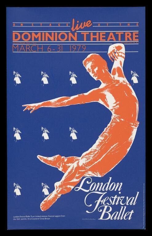
This poster captures the visual vocabulary through which classical ballet was marketed and understood in the late 1970s: the idealization of the male dancer's power and extension, the graphic abstraction of the moving body, the synthesis of modernist design with theatrical spectacle. For anyone studying dance history, design history, or the representation of dancers' bodies in commercial and cultural contexts, this image reveals the aesthetic values and commercial strategies of a major ballet company at a pivotal moment in British dance culture.
What you are looking at
A vivid promotional poster for the London Festival Ballet, rendered in a striking modernist style dominated by deep blue and burnt orange. The composition centers on a single male dancer captured mid-leap, his body arched in a dramatic diagonal that cuts across the frame. His musculature is rendered in sharp, graphic orange silhouette against the blue ground, emphasizing the explosive power of the jump. One arm extends fully to the left while the other is raised toward his body; both legs are extended in a split or near-split configuration suggesting either the height of elevation or an illusion of weightlessness. The dancer wears what appears to be a sleeveless shirt or singlet and tights. Arranged in a regular grid pattern across the upper and lower fields of the poster are repeated small white silhouettes of the theatre itself—the Dominion Theatre—establishing the venue and creating a rhythmic visual echo. At the base, elegant script lettering identifies 'London Festival Ballet' and dates the performance to March 6–31, 1979. The typography at the top reads 'live' above 'DOMINION THEATRE,' with horizontal lines framing the text in a geometric, Art Deco-influenced manner. The overall effect is one of dynamic energy and theatrical glamour.
The dancing
A single male dancer dominates the composition, captured in a soaring vertical leap with maximum extension. His body is fully arched, displaying the considerable flexibility and control required for this height and shape. The arms are positioned with sophisticated spatial awareness—one reaches away from the body, the other gathered near—creating a sense of controlled momentum rather than flailing. Both legs are extended in what appears to be a lateral split or a wide extension suggesting both height and flexibility. The dancer's silhouette is clean and decisive, with particular attention to the articulation of the limbs and the angle of the torso, suggesting the artist understood the demands of trained ballet technique.
The dance depicted
This is contemporary classical ballet as performed by the London Festival Ballet in 1979. The imagery captures the hallmark vocabulary of mid-twentieth-century ballet promotion: the soaring vertical leap, the extended limbs, the apparent defiance of gravity. The dancer's posture and the height of the jump suggest classical training in the tradition of Russian or European ballet schools. The aesthetic of the pose—with its emphasis on line, extension, and weightless elevation—belongs to the neoclassical or contemporary classical ballet vocabulary that characterized major companies of this era. The London Festival Ballet (founded 1950) was one of Britain's leading ballet companies, known for both classical repertoire and contemporary works.
How it was made
This is a lithographic poster, a medium that allowed for bold areas of flat color and graphic simplification ideally suited to theatrical promotion and street display. The artist—Anthony Crickmay, a photographer and graphic designer—has used the possibilities of lithography to create a design of striking visual economy: the human figure reduced to essential musculature and line, the color palette stripped to two dominant hues plus white. Lithography's ability to produce fine detail in the facial features and anatomical definition of the torso is evident here, while the medium's capacity for bold graphic areas gives the background and repeated motifs their commanding presence. This technique allowed for economical large-scale reproduction suitable for cinema hoardings and poster sites, ensuring visibility and impact in the urban environment where ballet companies needed to attract audiences.
About this work
This is a promotional poster for the London Festival Ballet's season at the Dominion Theatre in London during March 1979. It represents the aesthetic vocabulary of mid-twentieth-century ballet marketing: the celebration of the male dancer's athleticism, the emphasis on vertical extension and weightlessness, the graphic modernism that positioned ballet as contemporary and dynamic rather than archaic. The work sits at the intersection of theatrical design, graphic modernism, and dance promotion, documenting both a specific historical moment in a major British ballet company's seasons and the visual language through which ballet presented itself to the public during this period. As a poster, it is a primary document of how dance was sold, how dancers' bodies were represented to potential audiences, and how the aesthetics of modernist design shaped the visual culture of performance.
How to look at it
Attend first to the moment of maximum extension the artist has chosen: the dancer is captured not in a preparatory state or a landing, but at the apex of the leap, fully extended and seemingly suspended. This freeze-frame captures the ideal form toward which ballet training aspires. Notice how the artist uses silhouette and color contrast to emphasize musculature and line—the rendering is not realistic but graphic, distilling the figure to its essential geometry. The repeated theatre silhouettes create a visual rhythm that mirrors the pulse and repetition of performance, while the spare color palette and clean lines situate the image within modernist graphic design conventions. The composition is asymmetrical and dynamic, using negative space to amplify the sense of vertical lift.
The artist
Anthony Crickmay (1919–2010) was a British photographer and graphic designer who became renowned for his dance photography and theatrical design, particularly his work documenting and promoting British ballet and modern dance throughout the mid-to-late twentieth century. He photographed extensively for major companies including the Royal Ballet and the London Festival Ballet, and his graphic design work—such as this poster—brought the aesthetics of modernist graphic design to dance promotion. His visual language combined the documentary clarity of his photographic practice with the bold geometric abstraction characteristic of mid-century poster design, creating images that were both dynamically artistic and commercially effective.
The period
In 1979, classical ballet in Britain was enjoying significant public presence, with the London Festival Ballet and the Royal Ballet as the two major national companies competing for audiences and funding. The aesthetic of this poster—with its emphasis on the spectacular athleticism of the male dancer—reflects a broader shift in ballet's self-presentation during the 1970s, when male technique and virtuosity had become central to the art form's appeal, particularly in the wake of dancers like Mikhail Baryshnikov and a general cultural embrace of physical display and bodily perfection. Graphically, the poster belongs to the international idiom of modernist poster design, with echoes of constructivism and art deco, filtered through the commercial aesthetics of 1970s theatrical promotion. The date also coincides with the height of the London Festival Ballet's prominence and international touring success.
Where it lives
This poster is held in the Victoria and Albert Museum as a theatrical poster. It represents the category of printed promotional materials produced for commercial distribution and public display, documenting both the aesthetic conventions and the commercial strategies of mid-twentieth-century British ballet companies.
Dance in this work
Questions about this work
Who is the dancer shown in the poster?
The catalogue record does not identify the specific dancer. In 1979 the London Festival Ballet's roster included several male principals capable of the virtuosity this image displays, but the poster is designed as a graphic abstraction of the company's style rather than a portrait of a named individual. Crickmay's photographic work for the company may contain the source image or studies, but the poster itself is about the ideal of ballet rather than a particular person.
What is the significance of Anthony Crickmay as a designer?
Crickmay was one of Britain's most important dance photographers of the twentieth century, equally skilled in documentary photography and graphic design. He brought photographic precision and modernist graphic sensibility to the visual representation of dance, creating images that were both artistically sophisticated and commercially compelling. His work shaped how British ballet companies presented themselves to audiences during a crucial period of cultural expansion.
How does this image represent the aesthetics of 1970s ballet?
The emphasis on the male dancer's explosive athleticism, the focus on vertical extension and weightlessness, and the graphic modernism all reflect the aesthetic values of 1970s ballet. This era saw male technique elevated to unprecedented prominence, and companies marketed themselves through images of spectacular virtuosity. The modernist design language presented ballet not as an historical art form but as contemporary and dynamic.
Why would a theatre use such a stark graphic style for a ballet poster?
Stark graphic design was more memorable and eye-catching at street scale than naturalistic imagery, and the modernist aesthetic positioned ballet as a sophisticated, contemporary art form rather than a historical curiosity. The bold color contrast and simplified forms ensured the poster would be visible from a distance and would stand out among competing theatre advertisements. The style also communicated artistic seriousness and visual intelligence to the educated audiences ballet companies sought.
More dance artwork