49 works in this view — arrow keys or swipe to move between them.
Dance in Art
Poster
Cooper, Bill
- Collection:
- Poster
- Source:
- Victoria and Albert Museum
- Rights:
- Rights vary by item — check the source record before reusing this image. Source record ↗
- Recorded as:
- V&A — check rights per item
For historians of British ballet, this poster documents the Sadler's Wells company's repertoire and visual identity at a specific moment. For students of design and advertising, it exemplifies how 1980s theatre marketing balanced photographic realism with graphic boldness. For dancers, the image is a record of how classical ballet was packaged and presented to audiences—a comment on the genre's aesthetics and its appeal.
What you are looking at
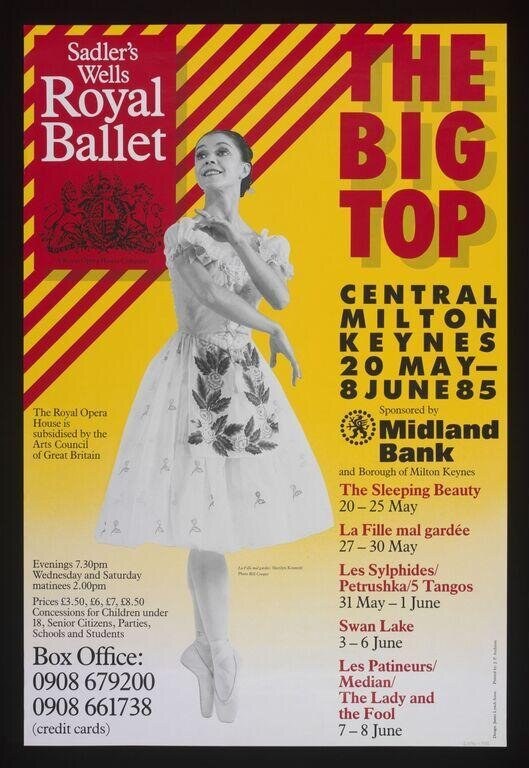
A promotional poster for Sadler's Wells Royal Ballet's 1985 season at the Big Top in Central Milton Keynes. A young female dancer in a classical tutu dominates the composition, photographed against a striking graphic design of bold red and yellow diagonal stripes. She is captured mid-arabesque or in a balletic port de bras, her body angled upward in a graceful, expectant pose. She wears a romantic-era style tutu decorated with a dark floral or foliate motif across the skirt, and her pale pointe shoes are visible below. The photograph is rendered in black and white against the vivid colored ground, creating strong visual contrast. The text identifies the venue and dates (20 May–8 June 85), lists the season's ballets (The Sleeping Beauty, La Fille mal gardée, Les Sylphides/Petrushka/5 Tangos, Swan Lake, Les Patineurs/Median/The Lady and the Fool), and provides box office numbers. The Midland Bank appears as sponsor.
The dancing
A single soloist is the subject, posed in a classical ballet line. Her weight appears lifted through an extended leg, the supporting leg controlled and turned out, the torso elongated and the head tilted upward in an expression of aspiration or longing. Her arms frame the body in a gentle, open port de bras. The pose is fundamentally static rather than caught mid-movement, suggesting either a preparation, a held balance, or the photographer's choice to arrest the moment as a portrait of ideal balletic form. The figure fills the frame as the sole dancer.
The dance depicted
This is theatrical ballet, specifically the classical romantic tradition. The tutu style, the pointe work, the turned-out carriage of the body, and the port de bras are all markers of classical ballet as practised by professional ballet companies of the Sadler's Wells tradition in Britain. The pose and the costume allude to the romantic ballets in the season (The Sleeping Beauty, Swan Lake, Les Sylphides), though it is presented as an idealized type rather than a character from a specific narrative. The image presents ballet as grace, aspiration, and technical refinement—a marketing strategy that emphasized the company's classical credentials.
How it was made
This is a photographic poster, combining a black and white photograph of a dancer with graphic design. The image appears to be a print (likely offset lithography or photolithography, standard for theatre publicity of the 1980s). The photograph itself was taken by a professional dance photographer—the lighting is controlled, the focus is sharp on the dancer's body, and the composition is carefully framed. The graphic designer has then placed this photograph against boldly colored geometric grounds (the diagonal stripes) and added text. This was a standard approach for theatre marketing by the 1980s, balancing the promotional pull of a photographed dancer against the visual impact of graphic modernism.
About this work
This is a promotional poster for a classical ballet season, created to advertise Sadler's Wells Royal Ballet's performances in Milton Keynes in summer 1985. It presents ballet as a visual and aspirational form, embodied in the figure of a single female soloist in a romantic tutu. The poster sits at the intersection of dance documentation (the photograph is a faithful record of a real dancer in real costume) and advertising design; it was meant to be seen on street hoardings and in venues, drawing audiences to a season of canonical classics. The work belongs in a gallery of dance imagery because it shows how ballet was sold to the public, how the art form understood itself, and how the medium of photography was used to authenticate and beautify the live performance.
How to look at it
Look at the dancer's line first: the vertical stretch through the body, the lift of the ribs, the angle of the head. These tell you how classical ballet understands the body—as an instrument of proportion, control, and grace. Then look at the relationship between the photograph and the ground: the designer has chosen colors (red and yellow, the warmest and most energetic on the spectrum) that make the cool, delicate body of the dancer stand out. The stripes create movement on the page, a dynamic energy that contrasts with the dancer's stillness. The composition is also telling you something about the hierarchy of value: the dancer occupies the visual center, and the text is secondary, supporting the image rather than dominating it. The tutu's patterning—unusual, with a dark design—is a detail that distinguishes this dancer from the generic ballerina type.
The artist
Bill Cooper was a British graphic designer working in the 1970s and 1980s, known for theatrical and cultural posters. His work often combined photography with bold geometric or typographic elements, reflecting the modernist design principles of his era. The confidence and clarity of this poster—the assured placement of the photograph, the strong color choices, the legible hierarchy of text—suggest a designer well versed in the constraints and opportunities of theatrical publicity.
The period
In the mid-1980s, classical ballet was undergoing a phase of institutional stability in Britain. Sadler's Wells Ballet (soon to become the Birmingham Royal Ballet) was a major national company, and the season shown here—leaning heavily on 19th-century classics—reflects the repertoire-based model that dominated British ballet. Photographically, the 1980s saw dance photography move toward more dynamic and expressive documentation; the stillness of this image, by contrast, suggests a poster aesthetic that valued composure and clarity over movement capture. Graphic design in this period was embracing primary colors and geometric forms, influenced by postmodern and punk aesthetics, though this poster remains relatively restrained in its use of color and form.
Where it lives
This is a theatre poster, held in the Victoria and Albert Museum's collection. It is a printed object, one of many thousands produced for public distribution, designed to reach potential audiences. As such, it is both an artwork and an industrial product—its value lies partly in its aesthetic quality and partly in its historical witness to how institutions promoted themselves.
Dance in this work
Questions about this work
Who was the dancer in the photograph?
The catalogue record does not identify the dancer. The image presents her as a type—the ideal classical ballerina—rather than as a named individual. It is possible that the dancer was a principal of Sadler's Wells, but without additional documentation or recognizable features, identification is not certain.
What do the ballets listed on the poster tell us about the company?
The season consisted entirely of canonical classics: The Sleeping Beauty, Swan Lake, Les Sylphides, and La Fille mal gardée. This repertoire reflects the company's identity as a guardian of the classical tradition. The inclusion of Petrushka and the Tango (from a modern choreography) and Les Patineurs (a character piece) suggests that the company also performed shorter works alongside the major ballets, offering variety within a fundamentally conservative programming strategy.
Why would a ballet company tour to Milton Keynes in 1985?
Milton Keynes was designated a new town in the 1960s and 1970s, with investment in cultural infrastructure including the Big Top (a performance venue). Regional touring was and remains central to British arts policy; companies like Sadler's Wells would perform outside London to build audiences and fulfill public funding obligations. The 1985 visit was part of a national culture of decentralized arts provision.
What is the tutu's pattern?
The tutu is decorated with a dark floral or foliate design, suggesting either embroidery or appliqué. This is not the plain romantic tutu of 19th-century aesthetic but a 20th-century variation, adding visual interest and character. The pattern may have been chosen specifically for photographic and poster reproduction, as it reads clearly in black and white and adds detail that the eye enjoys.
More dance artwork