49 works in this view — arrow keys or swipe to move between them.
Dance in Art
Poster
Crickmay, Anthony
- Collection:
- Poster
- Source:
- Victoria and Albert Museum
- Rights:
- Rights vary by item — check the source record before reusing this image. Source record ↗
- Recorded as:
- V&A — check rights per item
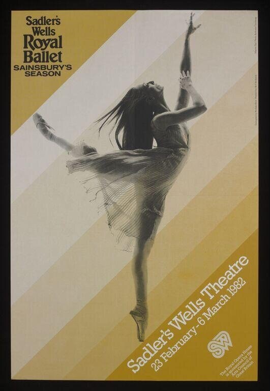
This poster documents how classical ballet was marketed to the public in the early 1980s, when Sadler's Wells was establishing itself as a major venue. It also exemplifies how graphic design translated dance into visual language for a mass audience—prioritizing the feeling of ascent and freedom over literal representation.
What you are looking at
A promotional poster for the Royal Ballet's 1982 season at Sadler's Wells Theatre, featuring a single dancer captured mid-leap against a geometric background of bold diagonal stripes in gold and cream. The dancer's body is rendered in expressive charcoal or pencil with a sketchy, energetic quality that conveys movement rather than photographic precision. The figure is suspended in a dramatic vertical jump with one leg extended high and the other bent, arms reaching upward with fingers splayed, the head thrown back with long dark hair streaming downward. The dancer wears what appears to be a classical ballet costume—a fitted bodice and skirt rendered in loose, gestural marks. The composition is dominated by the ascending diagonal lines that frame and emphasize the dancer's upward trajectory. The text placement is economical: 'Sadler's Wells Royal Ballet' and 'Sainsbury's Season' occupy the upper left, while 'Sadler's Wells Theatre' and the dates '28 February–6 March 1982' run along the right edge in a modern sans-serif typeface.
The dancing
A single female dancer in an elevated jump with the torso vertical and the head tipped back. The raised leg extends nearly to shoulder height; the supporting leg bends beneath the body. Both arms reach upward in an open, expressive frame with the elbows relaxed and fingers extended—a posture suggesting joy and abandon rather than classical restraint. The sketch-like rendering conveys weight and momentum, and the hair movement reinforces the sense of upward propulsion.
The dance depicted
This is almost certainly classical ballet, given the costume (fitted bodice and skirt), the pointe-work implied by the single supporting leg, and the vertical leap. The pose itself does not correspond to a named step or variation; rather, it is a moment of joy and freedom—a generic image of ballet's upward aspiration. It appears to be a Romantic-era aesthetic (the abandonment, the hair, the emotional quality) rendered in a modernist graphic style.
How it was made
This is a lithographic poster, established by the broad charcoal marks, the tonal modulation, the registration of overlapping colors (the gold and cream stripes, the black of the figure), and the legibility of the design at small scale. The sketchy figure contrasts deliberately with the clean geometric background, a common Modernist poster strategy of the 1960s–80s. The technique allows for hand-drawn energy while maintaining the precision needed for repeated printing and public visibility.
About this work
This is a season poster for a major classical ballet company, designed to attract audiences to a six-week run at a London landmark venue. The work sits in the tradition of modernist dance publicity—using abstraction and geometric form to signal sophistication while keeping the central image legible from a distance. Posters like this were ubiquitous in urban public space and constitute a significant body of dance documentation, capturing not the performance itself but the promise and idea of it. The artist's choice to fragment the figure into expressive marks rather than smooth realism was a deliberate strategy to convey movement and emotion over anatomical accuracy.
How to look at it
Attend first to the vertical composition and the diagonal lines: the artist has made the dancer climb the picture plane, reinforcing the metaphor of ballet as weightless ascent. Notice the contrast between the careful geometry of the background (the stripes, the typography) and the loose, gestural rendering of the body—this tension between control and expressiveness mirrors classical ballet's own aesthetic. The head-tilt and arm position are the emotional core: this is not a technical pose but a moment of release.
The artist
Anthony Crickmay was a photographer and designer associated with British dance in the mid-to-late 20th century. His work frequently documented ballet and contemporary dance, and his posters and programmes for major companies contributed significantly to the visual culture of British dance.
The period
In 1982, British ballet was thriving. The Royal Ballet was at the peak of its international standing under Norman Morris's direction. Sadler's Wells Theatre, as the home of the Royal Ballet's second company (later renamed Birmingham Royal Ballet), was a major venue for classical repertory and new work. The modernist poster aesthetic—geometric backgrounds, expressive figuration, sans-serif type—was standard for cultural institutions in this period, influenced by 1960s–70s design movements but still current in the early 1980s.
Where it lives
This is a lithographic poster held in a design collection (noted as source 'va', likely the Victoria and Albert Museum's Theatre Collection). It is a documentary artifact of public communications rather than a unique artwork—many copies were printed and distributed.
Dance in this work
Questions about this work
Is this an actual ballet dancer or a stylized figure?
Almost certainly a stylized figure rather than a portrait of a particular dancer. The poster is a generic representation of ballet's aesthetic—joyful, weightless, upward-striving—designed to appeal to a broad audience. The sketchy rendering allows the viewer to project their own image of a dancer.
What ballet is being advertised?
The poster does not name a specific ballet; it is advertising the entire season (28 February–6 March 1982) at Sadler's Wells. Audiences would have consulted a printed programme to learn what works were being performed.
Why is the design so geometric and modern when classical ballet is historical?
This was a deliberate strategy in 1960s–80s cultural marketing: modernist design signaled prestige, education, and forward-thinking patronage. It also made the poster eye-catching in public space and differentiated ballet from popular entertainment.
More dance artwork