49 works in this view — arrow keys or swipe to move between them.
Dance in Art
The Nutcracker
Crickmay, Anthony
- Collection:
- Poster
- Source:
- Victoria and Albert Museum
- Rights:
- Rights vary by item — check the source record before reusing this image. Source record ↗
- Recorded as:
- V&A — check rights per item
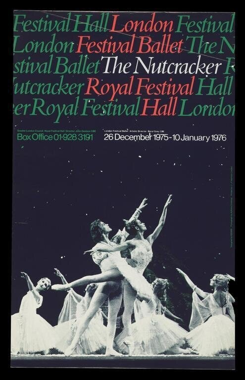
This image is valuable for understanding how classical ballet was circulated, marketed, and understood in 1970s Britain, and what the ballet looked like in performance at that moment. The poster also demonstrates the enduring power of the lifted partnering and romantic tutu as visual shorthand for 'ballet' itself—a convention so strong that it survives even now. For anyone studying the history of The Nutcracker as a performed work, this is evidence of its presence in major British venues and of the visual language used to sell it.
What you are looking at
A poster advertising a 1975–76 London production of The Nutcracker at the Royal Festival Hall. The upper half is a typographic composition in green, coral, and white sans-serif text, the words—Festival, Hall, London, Ballet, Nutcracker—layered and overlapping in different sizes and colors, creating visual rhythm without narrative order. The lower half shows a photograph of the ballet itself: a male dancer in pale tights lifts a female dancer en attitude derrière, both in white romantic tutus with gossamer skirts. Four female dancers in identical costume frame the central pair, two visible on either side, creating a corps de ballet effect. The stage lighting is cool and stark, throwing the white tutus into high contrast against the dark background, which is scattered with small white points suggesting stage lighting or a starlit backdrop. The composition emphasizes the lift—a moment of weightlessness and partnering—which is the hero gesture of classical ballet.
The dancing
The male dancer supports the female in a high, sustained lift, his arms secure at her waist, her body extended with her supporting leg straight and her working leg bent in attitude. Her arms are raised in port de bras, and her head is tilted back in the classical épaulement of romantic ballet. The surrounding corps dancers stand in relaxed classical positions, their tutus full and weightless. All dancers are en turnout, and the framing of the central couple by the corps on either side creates a formal, symmetrical composition that reads as a tableau rather than a moment of continuous action.
The dance depicted
This is a scene from The Nutcracker, the canonical classical ballet choreographed by Lev Ivanov and Marius Petipa for the Imperial Ballet in 1892. The lifted partnering, the white romantic tutus, and the corps de ballet framing suggest this is likely a scene from Act II (the Land of Sweets or similar scene), where such lifted adagio passages are characteristic. The style of the lift and the body positions—the sustained épaulement, the attitude derrière, the formal symmetry—all confirm this as classical ballet technique of the academic tradition. The image captures the ballet as it would have been performed in mainstream British ballet companies of the 1970s.
How it was made
This is a printed poster, most likely lithography or offset lithography, which was the standard commercial printing process in 1976. The text portion shows the crisp, flat color fields typical of graphic design of the period, while the photograph of the dancers has been reproduced as a half-tone or continuous-tone image and positioned beneath the typography. The combination of bold sans-serif type (characteristic of 1970s modernist design) with a high-contrast performance photograph creates a striking visual contrast and suggests the designer was treating the ballet as a contemporary cultural product rather than a historical artifact.
About this work
This is a promotional poster for a major London ballet production, capturing both the visual language of 1970s graphic design and a key moment of classical ballet technique. The Nutcracker, first performed in 1892, was and remains the most frequently performed full-length ballet in the world, and its presence in the London Festival's repertory in the 1975–76 season affirms its status as a cornerstone of classical ballet. The poster is a document of how Nutcracker was marketed and experienced in Britain during this period—as a prestigious, visually beautiful, accessible work that bridged high culture and popular entertainment. It also records the ballet's aesthetic at a specific moment: the romantic tutus, the classical vocabulary, and the partnering style shown here represent a particular lineage of performance practice, distinct from the modernist approaches emerging elsewhere in contemporary dance.
How to look at it
Notice how the poster divides into two registers: the pure abstraction of layered typography above, and the moment of human partnership below. The typography suggests movement and energy through overlap and scale variation, while the photograph captures a single gesture—the lift—which requires trust, strength, and precise technique. Attend to the symmetry of the composition: the central couple and framing corps create a formal, almost sacred arrangement typical of classical ballet's visual language. The white tutus and cool lighting emphasize weightlessness and ethereal beauty, qualities that were central to how romantic and classical ballet positioned itself aesthetically.
The artist
Anthony Crickmay (1916–2008) was a leading British dance photographer and poster designer of the mid-20th century. He is best known for his photographs of ballet, contemporary dance, and theater, and for the graphic design of promotional materials for major British venues and companies. His posters often combined striking typography with high-quality performance photography, treating dancers as subjects of visual and cultural significance rather than mere illustrations.
The period
The Nutcracker's place in the British ballet canon was firmly established by the 1970s, particularly through the popularity of the Royal Ballet's production (first premiered in 1954 with Frederick Ashton's choreography). The ballet had become a fixture of the Christmas season and a major draw for audiences, combining accessibility, spectacle, and the prestige of classical technique. In graphic design, 1970s British modernism favored bold, sans-serif typography and asymmetrical layouts, as seen in this poster. The juxtaposition of abstract letterforms with figurative photography reflects the period's visual vocabulary and the growing professionalization of arts marketing.
Where it lives
This poster is held in the V&A (Victoria and Albert Museum) collection, indicating its recognition as a significant document of design and performance history. It comes from the era when major museums and institutions began collecting dance-related ephemera as evidence of cultural practice and design practice.
Dance in this work
Questions about this work
Why are the dancers in white tutus?
White (or pale) romantic tutus are the costume standard for classical ballet, particularly for scenes set in magical or ethereal realms. In The Nutcracker, Act II takes place in the Land of Sweets or a dreamlike palace, where white tulle tutus are worn by the principal ballerina and corps. The full, weightless skirt became iconic shorthand for 'ballet' itself and survives in popular culture.
What is the lift shown here called?
This appears to be a supported adagio lift, likely with the ballerina in attitude derrière (back leg bent, supporting leg straight). In classical ballet terminology, such lifts are part of the adagio—the slow, supported section of a pas de deux or ensemble variation. The male dancer's secure frame and the female dancer's extended line demonstrate the partnering technique expected of professional ballet dancers.
Is this the Royal Ballet's production?
The poster credits the Royal Festival Hall in London but does not specify which ballet company performed this production. The Royal Ballet's Nutcracker (choreographed by Frederick Ashton) was the most widely performed British version, but this could have been another company's production.
Why design a poster this way—with abstract type and a photograph?
This layout reflects 1970s graphic design modernism: bold typography conveys energy and contemporaneity, while the photograph of dancers grounds the poster in the lived, physical reality of performance. The contrast between the two makes the poster visually memorable and treats ballet as both a visual art form and a contemporary cultural event worthy of sophisticated design.
More dance artwork