49 works in this view — arrow keys or swipe to move between them.
Dance in Art
Ballet Rambert poster
Carney, Michael
- Collection:
- Poster
- Source:
- Victoria and Albert Museum
- Rights:
- Rights vary by item — check the source record before reusing this image. Source record ↗
- Recorded as:
- V&A — check rights per item
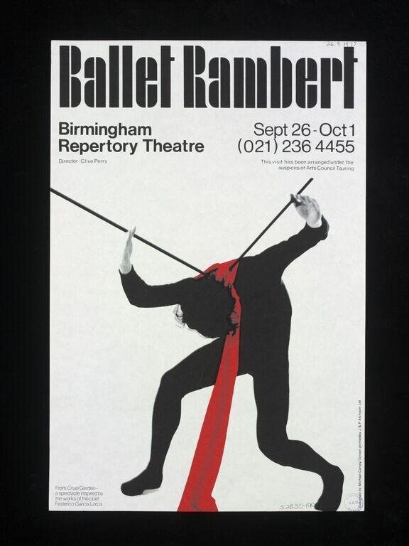
This poster documents a pivotal moment in British dance history: the complete visual and artistic reinvention of a company (Ballet Rambert, founded 1926 as a classical ballet troupe) into a cutting-edge contemporary dance ensemble. The image is evidence that by the late 1970s, the distinction between 'ballet' and 'contemporary' had become productively blurred, and that acrobatic vocabulary was increasingly central to avant-garde choreography. Carney's graphic design—minimal, bold, and humanistic—became an iconic visual language for contemporary dance promotion.
What you are looking at
A dynamic silhouette of a single male dancer captured mid-leap, his body twisted in a dramatic diagonal arc across the composition. He wears an all-black costume and grips two thin poles or ropes that extend diagonally across the frame, creating a stark geometric tension. A single brilliant red scarf or fabric element trails from his torso, the only color in the design, cutting a vivid line through the monochromatic palette. The figure is suspended between the two poles in a moment of extreme extension and control, his limbs fully engaged and his frame taut. The composition is austere and modernist, with a white background that emphasizes the clean lines of the figure and props.
The dancing
The dancer's body demonstrates extraordinary flexibility and strength. His weight appears suspended, supported by the grip of both hands on the poles while his legs are fully extended in opposing directions—one stretched upward and back, the other forward. The torso is dramatically arched, creating a spiral or corkscrew effect through the center line of the body. The arm positions show control and precision: both elbows are slightly bent, actively engaging with the poles rather than passively hanging. This is acrobatic work requiring both upper-body strength and extreme spinal mobility.
The dance depicted
This image most likely depicts contemporary acrobatic or aerial dance, possibly partner acrobatics (adagio work), though the figure's solitary form and the pole work suggest it may represent a solo acro-dance piece or possibly partner acrobatics where one dancer's form is displayed in isolation. The extreme flexibility, inverted positioning, and use of apparatus (the poles) are hallmarks of acro-dance competitions and performances. The red accent may represent costume detail or a prop integral to the choreography. Without additional context, the specific style cannot be definitively named, but the technical vocabulary is unambiguously acrobatic rather than classical ballet or contemporary dance.
How it was made
This is a printed poster, most likely produced by lithography or photolithography—a technique well-suited to bold graphic design and color separation. The stark graphic quality, the limited color palette (black, white, and red), and the strong contrast are characteristic of mid-to-late twentieth-century poster design. This printing method allowed for high-impact visual communication suitable for public promotion and wide circulation. The clean separation of figure from background and the graphic simplification of the form suggest the work was designed for legibility and visual impact at distance, essential for theatre advertising.
About this work
This is a promotional poster for Ballet Rambert, the renowned British contemporary dance company, designed by Michael Carney in 1977. It advertises performances at Birmingham Repertory Theatre from 26 September to 1 October. The image departs entirely from traditional ballet iconography, instead showcasing the acrobatic and physically extreme vocabulary that characterized avant-garde British dance in the 1970s. The red scarf becomes a visual signature of the company's modernity and dynamism, a counterpoint to the geometric severity of the composition.
The poster serves as both advertisement and artistic statement: it tells viewers they should expect not tutus and pointe shoes, but explosive, sculptural bodies in contemporary motion. The choice to depict a single figure in extreme extension—neither resting nor in a classical position—communicates risk, physical daring, and innovation. For a 1977 audience, this image would have announced that Ballet Rambert was not the ballet of their parents' generation.
How to look at it
Observe the precise moment captured: the dancer is neither ascending nor descending, but held in a frozen moment of maximum extension and strain. Note how the poles function both as literal apparatus and as compositional lines that structure the entire frame—they are not secondary to the figure but equal partners in the design. The red scarf draws the eye through the composition and provides the single note of warmth in an otherwise cool, geometric space. Consider the white background not as empty space but as an active element that allows every line of the body to read clearly. The poster demonstrates that a single figure, pushed to an extreme of physical possibility, can be more compelling than a scene with multiple dancers.
The artist
Michael Carney was a graphic designer working in Britain during the 1970s when modernist grid-based and minimalist design principles dominated poster and graphic practice. The clean lines, bold sans-serif typography, and bold use of negative space visible in this work are consistent with the International Typographic Style that influenced British design of the period. Carney appears to have worked extensively for cultural institutions, particularly theatres and dance companies, translating complex physical forms into graphic communication.
The period
In 1977, British contemporary dance was in the midst of a radical departure from classical ballet. Companies like London Contemporary Dance Theatre and Ballet Rambert (which had transformed under director Robert Cohan beginning in 1969) were integrating release technique, modern dance vocabulary, and acrobatic forms into the training and choreography of dancers. The visual language of dance marketing—which had been dominated by ethereal, romantic imagery—was shifting to emphasize athleticism, geometry, and avant-garde aesthetics. Carney's poster is situated at the intersection of this choreographic revolution and the broader 1970s graphic design embrace of minimalism and bold typography. The era privileged legibility and conceptual clarity over decorative flourish.
Where it lives
This poster is held in the Victoria and Albert Museum's collection of theatre and dance posters. It belongs to a rich archival record of British dance promotion and would have been distributed widely in the Birmingham area in 1977 to advertise the specific season.
Dance in this work
Questions about this work
Is this classical ballet?
No. While the poster advertises Ballet Rambert, the company had fully transitioned to contemporary dance by 1977. The acrobatic extension shown here—the extreme flexibility, pole work, and inverted positioning—belongs to contemporary and acro-dance vocabulary, not classical ballet technique.
What are the poles the dancer is holding?
They function as apparatus in the choreography, much like silks or ropes in aerial dance. The poles provide both a technical challenge (requiring upper-body strength and precise grip control) and a visual architecture that structures the composition. They may represent a specific prop used in the company's repertory.
Why is there a red scarf?
The red element may be part of the dancer's costume, a handheld prop integral to the choreography, or a design choice by Carney to draw the eye through the composition and inject visual energy into the stark design. Without seeing the actual performance, its exact function cannot be determined.
Who designed this poster?
Michael Carney, a British graphic designer working in the 1970s modernist idiom. His design captures the visual language of contemporary dance promotion in Britain during that era.
More dance artwork